Thursday, 26 February 2009

Tutorial 5

In this tutorial with have learnt how to use the reactor tool. This is a very useful tool which allows me to mimic the effect of gravity and collisions between different objects. It would be useful to use this tool for an animation of a bowling ball crashing into some pins. To simulate this animation all you have to do is follow the following steps.

First you have to create a plane which will be the ground on which the bowling ball will run down. You have to have the plane at an angle to allow the ball to roll down it. You then have to create the pins and the bowling ball. The next step is to add the ball and the pins to the "rigid body collection". This can be found in the "reactor" menu and then scroll down to "create object" and then scroll across to "Rigid Body Collection". A menu will then appear at the right hand of the screen. The next step is to add your objects to this menu. To do this you have to first click anywhere on the screen to add the "rigid body" symbol and then click on "add". A menu will now appear and you have to click on "select all" and then add. This applies all of your objects on the stage to the "rigid body collection".

The next step is to create a mass weight for your objects. To do this all you have to do is to go the "reactor menu" and then scroll down to the "open property menu". You then have to apply a mass to the mass box for each of the objects apart from the plane which acts as the ground.

All you have to do is now test your animation by going to the "reactor" menu and then scrolling down to "preview animation".

Monday, 23 February 2009

StoryBoard

This is a storyboard for the Channel Eden Idents.


Thursday, 12 February 2009

Tutorial 2

In this tutorial we have learnt to we learnt some more basics about animation. We learnt how to use the tool 'Path Constraints' that allow you to attach an object to a line. This tool will be very useful for my final project. To make an object follow a line you have to first create the object. I have used a sphere for my object but you could use anything. You then have to create the line using a circle or line spline. This spline will represent the path that the object will follow. You then have to click on the object that you want to animate and then go to the menu 'Animation', and then 'Constraints' and then scroll down to 'Path Constraints'. You then have to click on the path/Spline. You can also do this using a camera which is a very good way of creating movement in the scene.

Tuesday, 10 February 2009

Tutorial 1- The Basics

The main aim for this semester is to create three Idents for my chosen channel. An Ident is used by a television channel to allow the viewer to know what channel they are watching. They are usually a short animation or film that incorporates the channel logo or branding. The Ident will need to be innovative and interesting and all three of the Idents will need to be linked.
The animation is going to be created in Autodesk 3Ds Max. The first tutorial was used to give us an insight into how to animate using the program Autodesk 3Ds Max. I have used this program before to create non-animated images so I am already used to creating the images. I have never used this program to create animations so this will be all new to me.

The first aspect of animation that I learn was the pure basics such as the timeline, and the keys that will be used to animate the image. The Timeline is located at the bottom of the screen and it represents the length of the animation. Keys can then be placed onto this timeline to build up the animation. There are two different keys that can be used to animate the 3D model and they are called ‘Set Keys’ and ‘Auto Keys’. The ‘Auto keys’ are automatically placed onto the timeline when the button is clicked and the ‘Set Keys’ can be placed and duplicated as many times that is needed. To create an animation you have to first have to create the 3D object that you want to animate. You then place a ‘Set Key’ on this point on the Timeline where you want the animation to start. You then have to place another ‘Set Key’ further along the timeline where the next stage of the animation will be take place. The next stage is to move the 3D object to a different part of the stage. When the play button is clicked then timeline will play and this will show you the animation that you have just created. ‘Set Keys’ are more reliable than ‘Auto Keys’ so I will be using these to create my Ident.

In this tutorial I have learnt how to use a number of tools that will useful when completing this assignment. One of these tools is called the ‘Time Configuration Menu’. This menu allows me to change the animation length and FPS or Frames per Second. This Menu is located at the bottom right of the screen and the button image is a window with a plus sign at the bottom right hand corner.

Another useful tool that I was taught how to use is the ‘Curve Editor’. This can be used to change many different aspects of how the animation performs and looks. The different curves represents different parts of the how the object reacts and changing these curves changes the animation. The ‘Curve Editor’ can be used to create the whole animation but I will use this tool to edit the final animation.

The ‘Dope Sheet’ is tool that can be used to edit the animation and it can be used in conjunction with the ‘Curve Editor’. The ‘Dope Sheet’ is useful for adding sound and making sure that all of the different elements to the animation align with one another.
Another useful aspect of 3Ds Max that I could use is the ‘Motion Panel’. This is similar to the ‘Curve Editor’ and ‘Dope Sheet’ and can be used to affect the way the animation behaves and plays. This panel is located at the menu at the right hand of the screen and is represented by a picture of a moving wheel.

Schematic view is a tool that can be used to see the hierarchical view of all of the elements that make up the animation. This can be used to select specific parts of the 3D object that might be obscured by something else.

Thursday, 5 February 2009

Eden Mood Board

The channel that I have choosen to create my Idents for is the channel Eden. This channel contains programs about adventures and nature so my Idents will have to reflect this. I have choosen this channel because there is lots of creativity and ideas that can created for Idents. I can create something that symbolises a wide range of things such as nature and traveling to places. This is a Mood board that I created to give an insight into what feel I want for the final Ident animations. I have used the theme nature to create this mood board becuase that is the topic that I will probably use for my final Idents.

Wednesday, 10 December 2008

October Image Part Three

This is the third part of the Creation of the October Image. To create the body shape that will go under the Cloth I used Cylinders and Boxes that I then modified and placed them into the correct position. I had to create a rough look of a body to make the scene look more realistic and for the sheet to be placed over it. I then placed the body onto the operating table ready for the sheet to placed over it. I didn't need any textures on the body because it wont be seen.


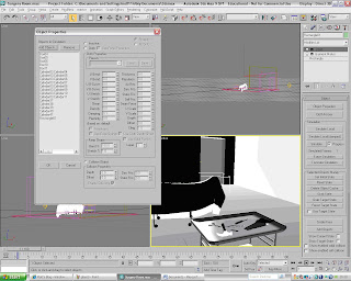
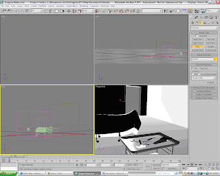
The next stage was to create the sheet that is going to be placed over the top of the body. I had to first create a rectangle that will become the sheet and convert to a poly. I then had to use the modifier called 'Garment Maker'. This is located in the drop down menu in the Modifier panel. This tool converts the rectangle into a material and allows the modifier 'Cloth' to be added to the rectangle. The 'Cloth' modifier is located in the same drop-down menu as the 'Garment Maker'. Once the 'Cloth' option has been the selected a menu panel appears at the right hand of the screen. This panel is used to create the cloth animation which will give the sheet its final look. Next you have to click on the 'Object Properties' Button which will load up a pop-up Menu called 'Object Properties'. You then have to add the body and the table which the sheet will lay over into the 'Objects in Simulation'. You then have to highlight all of the objects in this menu apart from the Sheet (Rectangle) and then click on the option 'Collision Object' which is a little check box. The next thing to do is to click on the sheet and then click on the check box named 'Cloth' located at the top of the screen. Now you have to click on OK and then click the button named 'Simulate Local'. The Simulation will now run and the Cloth will be placed over the body and the operating table.


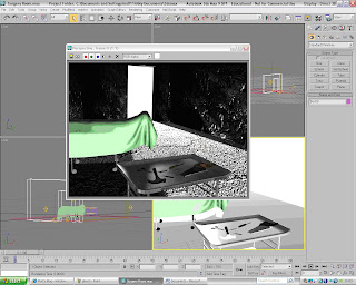
This is what the cloth looked like when the animation was complete. The addition of the body under a cloth really adds to the mood of the image and creates a focal point for the audience observing it.


I then added some lighting to the scene to give the scene more atmosphere. I used a 'Target spot' for the light coming through the door way and I have also used some Omni lights to the scene. The picture below is the final rendered image of the October Image. All that is needed now is to transfer it into to photoshop and then add the finishing touches.

Tuesday, 9 December 2008

October Image Part 2

This is the second part of the creation of the October Image. The next step is to create the top of the table. I started off by creating a box which will be the main body of the tabletop. I made sure that when I created it I used lots of segments. I used about 15 for the each of the hieghts, Length and the width. This will then allow me to get the shape that I wanted for the table top. To get the curved edge I highlighted the edge of the the table and used the tool 'TurboSmooth'. This smoothed the edge to get the look that I wanted.


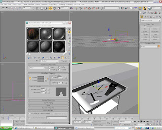
The next step was to add the texture to the table to give it more realism. I first found some textures off of the Internet and then transfered them into Adobe Photoshop. I then modifyed the Bitmap image and I then imported it into the Material Editor in 3Ds Max. I then transfered the material onto the Shapes that make up the Table. The Shader Basic Parameters that I used for the table materials was 'Metal'. This made the material look more like metal which was the look I was after.


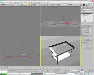
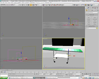
The next stage of the October Image is to create the operating table where the body will be placed. The Body will have a sheet placed over it so that doesnt need to be much detail implemented into the table. To create the table I used the same technique that I used for the other table. I used cylinders for the legs and boxes for the actual surgery tabletop. The one difference of the operating table was to create wheels. I used cylinders that were rotatated and resized amd then moved into position. The wheels give the table more detail and make the image more interesting. I then added the same textures to the operating table as I have done for the other table.


The next stage of the Image is to create the tools that will be placed onto the table. I created them using Splines which I then extruded the shapes. This made them look more like 3D images and added to the dark feeling of the picture. I had some trouble when I created the handle of the Saw. To create the handle I first create the outline by using the spline 'Line' tool. I then converted it into a 'Poly' and then extruded the face. This made it look more 3D. The next step was to create the whole in the handle. To do this I had to use the tool 'ProBoolean' to cut out the shape. I first create a sphere and then placed inside the handle where I wanted the hole to be. I then selected the 'ProBoolean' tool located in the Compound Objects Menu at the right hand of the screen. I then Subtracted the Sphere from the Handle and this gave me the shape that I wanted. I then had to add the textures to the tools to make them look more realistic and make them look part of the scene.


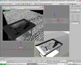
This is what the tools look like when they are fully rendered and with the Textures.